Here is a presentation I made on the audience feedback I gathered, along with my thoughts on the comments I received and how they can be taken into account when next editing the trailer.
(http://www.slideshare.net/GeorginaGilbey/audience-feedback-1-72420476)
Showing posts with label Research. Show all posts
Showing posts with label Research. Show all posts
Tuesday, 21 February 2017

Tuesday, 27 December 2016
Textual Analysis
Trailer 1: Starred Up (2013)
How might this trailer inspire my own?
This trailer might inspire my own in terms of its use of editing to create effective pacing, as I admire the way the durations of each shot are no more than a few seconds each, constantly keeping the audience on the edge of their seats as the tension increases. I like that the shots get faster in succession as the trailer comes closer to its end, meaning the last shot can be as high-impact as possible. This is a technique I would like to have in my own trailer, perhaps by ending the trailer with a 'punchy' or threatening last shot such as our character Anon holding a weapon. Cinematography is also a very important aspect of any trailer to me and so I would like to incorporate colour grading into my trailer. I think it will make it look more professional and attractive; it can be used to convey meaning and mood, which I think my less mainstream audience will enjoy.
Trailer 2: 10 Cloverfield Lane (2016)
How might this trailer inspire my own?
This trailer may inspire my own through its cinematography as I think the use of colour grading (blue hues juxtaposed with strong oranges and reds) is something that would make my trailer more striking, especially since part of my main character's costume will have bloodstains on it, although it is uncertain whether a blue tone, like 10 Cloverfield Lane uses, would be appropriate for the rest of our trailer. The element that 10 Cloverfield Lane emphasises the most is the soundtrack, as it gives subliminal messages and is dramatic, serving to raise the tension as the trailer progresses. I think using this technique and placing so much importance on the soundtrack (although not necessarily using music that has lyrics) would help massively when communicating our dark themes.
How might this trailer inspire my own?
This trailer might inspire my own in terms of its use of editing to create effective pacing, as I admire the way the durations of each shot are no more than a few seconds each, constantly keeping the audience on the edge of their seats as the tension increases. I like that the shots get faster in succession as the trailer comes closer to its end, meaning the last shot can be as high-impact as possible. This is a technique I would like to have in my own trailer, perhaps by ending the trailer with a 'punchy' or threatening last shot such as our character Anon holding a weapon. Cinematography is also a very important aspect of any trailer to me and so I would like to incorporate colour grading into my trailer. I think it will make it look more professional and attractive; it can be used to convey meaning and mood, which I think my less mainstream audience will enjoy.
Trailer 2: 10 Cloverfield Lane (2016)
How might this trailer inspire my own?
This trailer may inspire my own through its cinematography as I think the use of colour grading (blue hues juxtaposed with strong oranges and reds) is something that would make my trailer more striking, especially since part of my main character's costume will have bloodstains on it, although it is uncertain whether a blue tone, like 10 Cloverfield Lane uses, would be appropriate for the rest of our trailer. The element that 10 Cloverfield Lane emphasises the most is the soundtrack, as it gives subliminal messages and is dramatic, serving to raise the tension as the trailer progresses. I think using this technique and placing so much importance on the soundtrack (although not necessarily using music that has lyrics) would help massively when communicating our dark themes.
Tuesday, 22 November 2016
Research Into Institutions that Distribute Similar Products
Open Road Films (Source: http://www.openroadfilms.com/#about)
 Open Road Films are an American independent motion picture company; a subsidiary of the more renowned companies AMC Theatres and Regal Entertainment Group. They were founded in 2011 and mainly distribute films, supporting mainstream and more niche films alike. They distributed recent crime genre films Nightcrawler (2014) and Triple 9 (2016), posters for which are shown below:

 Nightcrawler follows a man named Louis Bloom, a crime journalist in L.A, who becomes obsessed with showcasing the most horrific stories, blurring the lines as he shifts from observational to taking part in making the crime appear extreme.
Triple 9 is about a gang of criminals and immoral, corrupted police officers in the US, who are working together to murder an officer in order to complete a heist.
Although Open Road have distributed these films and therefore shown an interest in crime genre films, they may be concerned only with the most mainstream productions: these two films, for instance, have a high-profile cast of stars and had a significantly large advertising campaign, suggesting a much larger budget than our small independent film, 'Illicit Obsession'. They are also an American company and so it will be even less likely that they would distribute our film.
Icon Film Distribution (Source: http://www.iconmovies.co.uk/about.html)
 This company is a British independent distributor formed in 1999. Some examples of crime genre films they have distributed are: Ransom (1996), Paparazzi (2004) and Edge of Darkness (2010). They appear to be interested in distributing smaller films rather than solely mainstream, which makes them a better candidate in terms of likelihood that they might represent our film as a distribution company. Below are some posters showing the crime films listed:

 Ransom is about a millionaire who's son gets kidnapped. He decides to pay the ransom fee but asks the FBI to investigate.
Edge of Darkness follows a detective who discovers his daughter's hidden life after she dies.
The styles of these films seem quite conventional in terms of the characters they feature and the plot, and so they may be interested in distributing a different kind of crime film, such as ours, that disregards conventions whilst including familiar iconography (such as props, like the gun featured on the poster for Edge of Darkness). This may be beneficial for them as our film aims to attract a wider audience of those who enjoy narratives that are outside of the norm.
Lionsgate (Source: https://www.lionsgate.com/corporate/)
 Lionsgate are a well-known UK/US independent company whose films have grossed over $7 billion at the global box office in the past four years. They distribute both British and American films (although their UK site is in development). I found that the UK organisation has distributed Brotherhood (2016), a small independent crime film, as well as more mainstream films such as Filth (2013) and Now You See Me 2 (2016).


In Brotherhood, (the last in a series of films started in 2006) main protagonist Sam Peele has seemingly left behind his violent past (he was in prison for murder) - until his brother is shot and his family is threatened.
Filth is about an immoral, corrupt police officer in Scotland who is a frequent drug user and trying to manipulate his way to a promotion so he has more power. It is more unconventional than most popular crime films in terms of this narrative.
Lionsgate could be an appropriate selection for my group's distributor as it has a UK-based company and seems to have an interest in targeting more niche audiences who are open to different structures of narrative and often strange or twisted characters (such as those seen in Filth). They may be open to representing our film for this reason.
TriStar Pictures (Source: http://www.sonypictures.com/corp/divisions.html)
 TriStar Pictures is a subsidiary group of Sony Pictures Motion Picture Group and have been responsible for distributing the crime films Money Monster (2016), Donnie Brasco (1997) and 88 Minutes (2007).


Money Monster (left) is about a TV presenter who finds himself threatened by an investor of the financial show who is forcing them to give him control of the studio.
Donnie Brasco is a more well-known film and follows an undercover agent who slowly crosses boundaries when he finds that he identifies more with a life in the mob than as an FBI agent. As this company is American and focuses on the mainstream, they would likely not be an appropriate choice, despite the fact that they have distributed crime films.
How will this research affect my ideas?
After researching these institutions that distribute similar products to my own, I believe it would be more fitting to select a company that is independent and UK-based (or at least owns some UK-based subsidiaries), but is still well-known, such as Lionsgate. This would make my group's trailer appear more professional and may encourage a wider potential reach in terms of my target audience, as they have worked with the small independent film Brotherhood (which has received a small number of reviews, including one by Empire magazine) which proves they are not only concerned with supporting high-concept mass-targeted films. Having Lionsgate as my distributor would allow it to be associated with films that are popular and have a large budget, meaning an audience who is familiar with Lionsgate's reputation already may want to take a chance on my smaller, independent film. Additionally, as they distributed Filth, a crime film with a very unusual narrative and characters, a similar audience may be attracted to my film as the trailer will display convention-breaking themes.


 Nightcrawler follows a man named Louis Bloom, a crime journalist in L.A, who becomes obsessed with showcasing the most horrific stories, blurring the lines as he shifts from observational to taking part in making the crime appear extreme.
Triple 9 is about a gang of criminals and immoral, corrupted police officers in the US, who are working together to murder an officer in order to complete a heist.
Although Open Road have distributed these films and therefore shown an interest in crime genre films, they may be concerned only with the most mainstream productions: these two films, for instance, have a high-profile cast of stars and had a significantly large advertising campaign, suggesting a much larger budget than our small independent film, 'Illicit Obsession'. They are also an American company and so it will be even less likely that they would distribute our film.
Icon Film Distribution (Source: http://www.iconmovies.co.uk/about.html)
 This company is a British independent distributor formed in 1999. Some examples of crime genre films they have distributed are: Ransom (1996), Paparazzi (2004) and Edge of Darkness (2010). They appear to be interested in distributing smaller films rather than solely mainstream, which makes them a better candidate in terms of likelihood that they might represent our film as a distribution company. Below are some posters showing the crime films listed:
 Ransom is about a millionaire who's son gets kidnapped. He decides to pay the ransom fee but asks the FBI to investigate.
 Edge of Darkness follows a detective who discovers his daughter's hidden life after she dies.
The styles of these films seem quite conventional in terms of the characters they feature and the plot, and so they may be interested in distributing a different kind of crime film, such as ours, that disregards conventions whilst including familiar iconography (such as props, like the gun featured on the poster for Edge of Darkness). This may be beneficial for them as our film aims to attract a wider audience of those who enjoy narratives that are outside of the norm.
Lionsgate (Source: https://www.lionsgate.com/corporate/)


In Brotherhood, (the last in a series of films started in 2006) main protagonist Sam Peele has seemingly left behind his violent past (he was in prison for murder) - until his brother is shot and his family is threatened.
Filth is about an immoral, corrupt police officer in Scotland who is a frequent drug user and trying to manipulate his way to a promotion so he has more power. It is more unconventional than most popular crime films in terms of this narrative.
Lionsgate could be an appropriate selection for my group's distributor as it has a UK-based company and seems to have an interest in targeting more niche audiences who are open to different structures of narrative and often strange or twisted characters (such as those seen in Filth). They may be open to representing our film for this reason.
TriStar Pictures (Source: http://www.sonypictures.com/corp/divisions.html)


Money Monster (left) is about a TV presenter who finds himself threatened by an investor of the financial show who is forcing them to give him control of the studio.
Donnie Brasco is a more well-known film and follows an undercover agent who slowly crosses boundaries when he finds that he identifies more with a life in the mob than as an FBI agent. As this company is American and focuses on the mainstream, they would likely not be an appropriate choice, despite the fact that they have distributed crime films.
How will this research affect my ideas?
After researching these institutions that distribute similar products to my own, I believe it would be more fitting to select a company that is independent and UK-based (or at least owns some UK-based subsidiaries), but is still well-known, such as Lionsgate. This would make my group's trailer appear more professional and may encourage a wider potential reach in terms of my target audience, as they have worked with the small independent film Brotherhood (which has received a small number of reviews, including one by Empire magazine) which proves they are not only concerned with supporting high-concept mass-targeted films. Having Lionsgate as my distributor would allow it to be associated with films that are popular and have a large budget, meaning an audience who is familiar with Lionsgate's reputation already may want to take a chance on my smaller, independent film. Additionally, as they distributed Filth, a crime film with a very unusual narrative and characters, a similar audience may be attracted to my film as the trailer will display convention-breaking themes.
Tuesday, 15 November 2016
Ideas Update & Inspirations
Ideas Update & Inspirations P3 from GeorginaGilbey
Additionally, I wanted to create a moodboard to show my creative vision through images on Pinterest. This has helped me to gather a broader range of ideas and helped me to experiment with what kind of imagery I'd like in the trailer, such as cinematography styles, iconography, props and more. Below is a screenshot and the link to my board is: https://uk.pinterest.com/georginagilbey2/film-trailer-inspiration/

Finally, I wanted to update my thoughts on the magazine cover and poster ...
The Poster:
My thoughts for the poster so far are to have a close-up of the main character Anon's mask, but have it stained with blood to connote the theme of murder. The background will most likely be black but I would like to incorporate more iconography related to hacking, such as faint lines of binary code or numbers. I want to include a tagline, most likely at the top of the poster, which I will discuss with my group. I may also use contrasting colours to make it more eye-catching. If possible I would like to produce two drafts and select the best design.
The Magazine Cover:
For the magazine cover my ideas so far are to have a close-up of Anon as the main image, with the bloodstained mask on but possibly with them lifting up the bottom of the mask slightly to reveal a sadistic-looking smirk, to suggest they are not the typical 'good' protagonist that the audience should root for. The main story line for this will probably be along the lines of an exclusive interview or review.
Additionally, I wanted to create a moodboard to show my creative vision through images on Pinterest. This has helped me to gather a broader range of ideas and helped me to experiment with what kind of imagery I'd like in the trailer, such as cinematography styles, iconography, props and more. Below is a screenshot and the link to my board is: https://uk.pinterest.com/georginagilbey2/film-trailer-inspiration/

Finally, I wanted to update my thoughts on the magazine cover and poster ...
The Poster:
My thoughts for the poster so far are to have a close-up of the main character Anon's mask, but have it stained with blood to connote the theme of murder. The background will most likely be black but I would like to incorporate more iconography related to hacking, such as faint lines of binary code or numbers. I want to include a tagline, most likely at the top of the poster, which I will discuss with my group. I may also use contrasting colours to make it more eye-catching. If possible I would like to produce two drafts and select the best design.
The Magazine Cover:
For the magazine cover my ideas so far are to have a close-up of Anon as the main image, with the bloodstained mask on but possibly with them lifting up the bottom of the mask slightly to reveal a sadistic-looking smirk, to suggest they are not the typical 'good' protagonist that the audience should root for. The main story line for this will probably be along the lines of an exclusive interview or review.
Saturday, 5 November 2016
Synergistic Marketing Research (Video)
Below is a video I made about synergy in advertising techniques of the 2012 horror film Cabin in the Woods. (https://www.youtube.com/watch?v=DG24oNkZpOk&t=19s)
Friday, 4 November 2016
Magazines & Audience Appeal
While a trailer is arguably the form of advertisement that has the most influence on how an audience might perceive a film, other forms of media such as posters, online promotion and print media (magazines, newspapers) are equally important in marketing campaigns in order to maximise the potential reach. Moreover, different advertising techniques and platforms are essential if a film wants to target as many people within a certain demographic as possible. For example, while an audience member may not pay attention to trailers or watch a lot of broadcast media, they may be an avid reader and prefer to read magazines or newspapers, which means that print media would be the best form of marketing to target them- but another may only watch trailers online, and so on, making positioning very important. Additionally, practicality is a must. For instance, if a film wanted to target the age group of adults in their 30s and decided to broadcast a trailer in the middle of the day- while it may reach the typical stay-at-home-mum during lunchtime hours, it wouldn't reach the ordinary working person and therefore wouldn't be maximizing their profit. Similarly, targeting students during school hours wouldn't be beneficial for obvious reasons, and in terms of posters, billboards may not get much attention from those driving past them.
Trailers are used to show the best moments in a film, making use of stunning visuals, the most memorable snippets of dialogue and any high-profile stars they may have, to catch the audience's interest- however, in magazines, there is the opportunity to be a lot more elaborate in terms of the production process and give the audience a deeper insight into the director's 'vision' and how the stars feel about the parts they play. Those in the audience who have more than a casual interest in the world of film would enjoy reading articles such as these; articles that not only review a film or urge them to pay to see it in cinema, but give them an 'exclusive' look into what really went into the film, through interviews or through a few stills or images of the film crew at work. Below are some examples of double page spreads, along with how they might appeal to their audiences.
 The double page spread on the left is from Sight & Sound magazine and features The Revenant on two double page spreads. Although this print form of advertising obviously can't show clips like a trailer can, it still has the advantage of showing the best visuals through stills. The one shown on the left has the main protagonist staring up at an ominous pile of bones, with the headline being "Call of the Wild". The image makes some use of negative space, with the large empty space in the top right which instantly draws the eye to the main protagonist and the dark, gloomy sky looming above him.
 The next spread includes more images and an extensive article about how the film was made and various struggles during production, as told by the director, in an interview of some form but with commentary from the writer of the piece. This would attract an audience who are interested in the creative process of the director Alejandro G. Iñárritu, as well as fans of Leonardo DiCaprio who plays the starring role. Although the article can't make use of sound or video, the images chosen take advantage of star appeal and showcase the most exciting moments in the film, while the article's contents explain the plot further and entice the audience to see it for themselves. Red font is used to grab the reader's attention in pull-out quotes (which are usually the most sophisticated, persuasive expressions in the article and sum up the writer's opinion: for instance, "'The Revenant' is a compelling study in obsession, an absorbing and complex look at the shifting dynamics between the hunter and hunted played out on a sweeping scale") and contrast with the desaturated blue tones of the images.
 These two double page spreads, the first featuring Batman V Superman and the second featuring 10 Cloverfield Lane are reviews which give an insight into what new films are like and whether they are worth seeing. They include a 'predicted interest curve' alongside the main article and a 'see this if you liked...' section, as well as pull-out quotes that serve to summarise the writer's general opinion. Neither of these spreads feature more than one image from the film and instead seem to use one official still that encapsulates the plot and its characters (The characters Batman and Superman going head to head being self-explanatory from the title, while 10 Cloverfield Lane's image shows its characters in the primary location, in an underground shelter). In conclusion, magazines can be very beneficial in terms of audience appeal because they can cater to multiple interests in that while some members may prefer or pay attention to a different format of advertisement, having such a broad marketing campaign ensures a wider potential reach. However, I believe that the creators of such campaigns need to be careful not to saturate or over-advertise the film because audiences can become tired or even resentful of seeing the advertisements everywhere and on every media platform, meaning they may be less likely to see the film purely because they are so bored of seeing it promoted, as it becomes less impactful.

Trailers are used to show the best moments in a film, making use of stunning visuals, the most memorable snippets of dialogue and any high-profile stars they may have, to catch the audience's interest- however, in magazines, there is the opportunity to be a lot more elaborate in terms of the production process and give the audience a deeper insight into the director's 'vision' and how the stars feel about the parts they play. Those in the audience who have more than a casual interest in the world of film would enjoy reading articles such as these; articles that not only review a film or urge them to pay to see it in cinema, but give them an 'exclusive' look into what really went into the film, through interviews or through a few stills or images of the film crew at work. Below are some examples of double page spreads, along with how they might appeal to their audiences.


 These two double page spreads, the first featuring Batman V Superman and the second featuring 10 Cloverfield Lane are reviews which give an insight into what new films are like and whether they are worth seeing. They include a 'predicted interest curve' alongside the main article and a 'see this if you liked...' section, as well as pull-out quotes that serve to summarise the writer's general opinion. Neither of these spreads feature more than one image from the film and instead seem to use one official still that encapsulates the plot and its characters (The characters Batman and Superman going head to head being self-explanatory from the title, while 10 Cloverfield Lane's image shows its characters in the primary location, in an underground shelter). In conclusion, magazines can be very beneficial in terms of audience appeal because they can cater to multiple interests in that while some members may prefer or pay attention to a different format of advertisement, having such a broad marketing campaign ensures a wider potential reach. However, I believe that the creators of such campaigns need to be careful not to saturate or over-advertise the film because audiences can become tired or even resentful of seeing the advertisements everywhere and on every media platform, meaning they may be less likely to see the film purely because they are so bored of seeing it promoted, as it becomes less impactful.
Tuesday, 1 November 2016
Magazine Textual Analysis
As the task besides the trailer is to make a magazine cover for my film, I have conducted some research into conventions of existing film magazines, namely: Total Film, Empire and Sight & Sound.
Total Film Analysis:
Sight & Sound Analysis:
Total Film Analysis:
Sight & Sound Analysis:
Friday, 21 October 2016
Film Poster Layout and Composition
Modern film posters employ a variety of layout and composition techniques to make them as visually appealing as possible and make the best use of their elements. Often, posters will use a combination of layout techniques to make the poster more complex and visually pleasing for the viewer. In the below powerpoint I will explain how these layouts work.
Film Posters: Layout and Composition from GeorginaGilbey
Is it important to keep to expectations or break away from them?
After investigating the different layout and composition techniques, I can definitely see that there are many benefits to each. Depending on the elements that are featured, different layouts can emphasise and draw the viewer's attention to specific areas, for example using a non-describing background style to make the viewer concentrate on the characters, props and costume.
While I believe that layouts should be chosen so they are appropriate for the elements featured, I think it is important to break conventions because it allows the film to stand out from the crowd in a sense and get the target audience's attention. Since my genre is crime and a lot of posters for crime films display similar iconography, this will be essential for my own.
The idea of a close-up appeals to me, but in order to make it different from others and convention-breaking, I could perhaps include some other features such as small, almost transparent images in the background. Additionally, because my film doesn't have a specific protagonist as yet, I could opt to feature the antagonist instead, both because they are the main driving force of the narrative and because I think this would get my target audience's attention (I defined them in my audience research as people who enjoy unconventional films). Audiences are undoubtedly aware of the iconography of all genres, due to the volume of films that are released every year, and so marketing campaigns have gotten more and more extreme to accommodate this. Therefore, I will need to ensure that my poster emphasises the difference in terms of the storyline and really gets the viewer's attention, perhaps through stark, disturbing visuals or a sense of enigma. To conclude, while I think it is important to clearly communicate the genre and keep to the audience's expectations in a sense so that there isn't any chance of a misinterpretation, I think it is even more important that my film in particular should break away from some conventions to ensure it is engaging and intriguing, especially in the marketing stage.
Is it important to keep to expectations or break away from them?
After investigating the different layout and composition techniques, I can definitely see that there are many benefits to each. Depending on the elements that are featured, different layouts can emphasise and draw the viewer's attention to specific areas, for example using a non-describing background style to make the viewer concentrate on the characters, props and costume.
While I believe that layouts should be chosen so they are appropriate for the elements featured, I think it is important to break conventions because it allows the film to stand out from the crowd in a sense and get the target audience's attention. Since my genre is crime and a lot of posters for crime films display similar iconography, this will be essential for my own.
The idea of a close-up appeals to me, but in order to make it different from others and convention-breaking, I could perhaps include some other features such as small, almost transparent images in the background. Additionally, because my film doesn't have a specific protagonist as yet, I could opt to feature the antagonist instead, both because they are the main driving force of the narrative and because I think this would get my target audience's attention (I defined them in my audience research as people who enjoy unconventional films). Audiences are undoubtedly aware of the iconography of all genres, due to the volume of films that are released every year, and so marketing campaigns have gotten more and more extreme to accommodate this. Therefore, I will need to ensure that my poster emphasises the difference in terms of the storyline and really gets the viewer's attention, perhaps through stark, disturbing visuals or a sense of enigma. To conclude, while I think it is important to clearly communicate the genre and keep to the audience's expectations in a sense so that there isn't any chance of a misinterpretation, I think it is even more important that my film in particular should break away from some conventions to ensure it is engaging and intriguing, especially in the marketing stage.
Thursday, 20 October 2016
Teaser Posters v Theatrical Posters
Teaser posters are promotions for a film that are designed to be mysterious and intriguing for the audience; a simplified version which may include an iconic symbol or image from the film. They don't often give a lot of information apart from the image and/or a tagline and may include a release date, or even just 'coming soon', as they are created so early in the marketing stage. Theatrical posters, however, are created a lot later in the production process of the film and will contain the majority of the conventions for film posters, such as the director, stars' names, main protagonists, and hints regarding the film's narrative. Below is an analysis of the differences between the teaser and theatrical posters for The Hobbit: The Battle of the Five Armies.
Teaser Poster:
 This poster for the last instalment of the The Hobbit series features the title, the tagline ("From the director of 'The Lord of the
Rings' trilogy"), the release date and the studios that produced the
film. The association with the director of The Lord of the Rings helps to attract a similar target audience and helps to create a 'hype', as anyone familiar with either franchise will know the director's style and likely quality of the film (as having such a director also implies a large budget, making the film high-concept).
This poster for the last instalment of the The Hobbit series features the title, the tagline ("From the director of 'The Lord of the
Rings' trilogy"), the release date and the studios that produced the
film. The association with the director of The Lord of the Rings helps to attract a similar target audience and helps to create a 'hype', as anyone familiar with either franchise will know the director's style and likely quality of the film (as having such a director also implies a large budget, making the film high-concept).
The main image shows Bilbo Baggins, the main protagonist, covered in dust and dirt, while ashes are falling, suggesting there is fire around him. With the context of this being 'the battle of the five armies', we know that there is a massive conflict in the film and so the fire and ashes seem likely and help to convey an ominous, foreboding and slightly sombre mood.
The main image's colour grading acts as the colour scheme for the poster, as it is quite dark and it appears to have been desaturated to the point where it is almost black and white, communicating a dark tone to the audience and making the poster more dramatic. The poster is enigmatic through the lack of information given; the only clue besides the tagline is Bilbo's facial expression as he stares into the distance, which appears determined but apprehensive, as if he is waiting for something to happen, leaving the audience asking questions such as: what is he looking at? What battle is he going to face?
Due to this already being an established franchise with two films preceding The Battle of the Five Armies, we can conclude that not a lot of information is needed for its teaser poster, as the image of the main protagonist, the title and the tagline are enough to generate interest and intrigue the audience.
Theatrical Poster:
 The theatrical poster has a lot more information, as it features the title, a different tagline, actor and director credits and an obviously more revealing main image. Although the release date is unspecified on this poster (it instead says 'coming soon'), it can still be considered as theatrical because of how much else it reveals compared to the teaser. Additionally, multiple posters were made in this film's marketing campaign, including teasers that feature other characters besides the protagonist individually, which could be a technique used in order to appeal to as many members of the target audience as possible, but this poster includes them all together. The fact that they are all included on this poster suggests a unified force battling against the antagonists, who are shown below them in a burst of fire.
Bilbo is positioned near the top of the poster and is the largest, again showing that he is the main protagonist, and wields a sword. This main image doesn't make use of direct address by having any of the characters look directly at the 'camera' as some posters do, but by having them all looking into the distance with determined expressions emphasises the severity of the battle they are facing. From top to bottom and right to left, the main protagonists are: Bilbo, Thorin, Gandalf, Bard, Legolas, Tauriel and Thranduil. Above them is 'Smaug', the dragon who threatens to destroy Lake-town.
The colour scheme is composed of red, orange, black and various hues of brown and grey. Compared to the teaser, it is a lot brighter and more eye-catching, but some of the characters such as Bilbo are still relatively desaturated, which gives it a dramatic and cinematic appearance. The bust of fire at the bottom connotes danger and the heat of the battle, while the grey and black clouds suggest impending darkness and conflict in terms of the film's theme. The narrative is therefore very clear to the audience, both through the use of props (swords, Gandalf's staff, Tauriel's bow and arrow) and through the distant collapsing buildings in the background that are emitting smoke.
Lastly, the bottom of the poster is reserved for the film's title, an additional sell line we saw used as a tagline on the teaser poster ("From the director of 'The Lord of the Rings' trilogy"), and the names of significant actors and the director, along with some studio logos and a promotion for 3D and HFR 3D (these are films that play visuals at twice the standard fps rate). If audiences are unfamiliar with the franchise, the section containing actors' names may interest them through star appeal: for example, Bilbo is played by Martin Freeman, Gandalf is played by Sir Ian McKellen, and so on. Similarly, the association with the director of The Lord of the Rings helps to appeal to fans of the much older franchise and extends their potential reach. To conclude, after conducting this analysis I think it is evident that while teaser posters are tailored to be intriguing and enigmatic for the audience to generate a 'hype' by giving away little information, theatrical posters aim to appeal through exposing more of the narrative and characters, making the target audience more clear.
Teaser Poster:

The main image shows Bilbo Baggins, the main protagonist, covered in dust and dirt, while ashes are falling, suggesting there is fire around him. With the context of this being 'the battle of the five armies', we know that there is a massive conflict in the film and so the fire and ashes seem likely and help to convey an ominous, foreboding and slightly sombre mood.
The main image's colour grading acts as the colour scheme for the poster, as it is quite dark and it appears to have been desaturated to the point where it is almost black and white, communicating a dark tone to the audience and making the poster more dramatic. The poster is enigmatic through the lack of information given; the only clue besides the tagline is Bilbo's facial expression as he stares into the distance, which appears determined but apprehensive, as if he is waiting for something to happen, leaving the audience asking questions such as: what is he looking at? What battle is he going to face?
Due to this already being an established franchise with two films preceding The Battle of the Five Armies, we can conclude that not a lot of information is needed for its teaser poster, as the image of the main protagonist, the title and the tagline are enough to generate interest and intrigue the audience.
Theatrical Poster:

Bilbo is positioned near the top of the poster and is the largest, again showing that he is the main protagonist, and wields a sword. This main image doesn't make use of direct address by having any of the characters look directly at the 'camera' as some posters do, but by having them all looking into the distance with determined expressions emphasises the severity of the battle they are facing. From top to bottom and right to left, the main protagonists are: Bilbo, Thorin, Gandalf, Bard, Legolas, Tauriel and Thranduil. Above them is 'Smaug', the dragon who threatens to destroy Lake-town.
The colour scheme is composed of red, orange, black and various hues of brown and grey. Compared to the teaser, it is a lot brighter and more eye-catching, but some of the characters such as Bilbo are still relatively desaturated, which gives it a dramatic and cinematic appearance. The bust of fire at the bottom connotes danger and the heat of the battle, while the grey and black clouds suggest impending darkness and conflict in terms of the film's theme. The narrative is therefore very clear to the audience, both through the use of props (swords, Gandalf's staff, Tauriel's bow and arrow) and through the distant collapsing buildings in the background that are emitting smoke.
Lastly, the bottom of the poster is reserved for the film's title, an additional sell line we saw used as a tagline on the teaser poster ("From the director of 'The Lord of the Rings' trilogy"), and the names of significant actors and the director, along with some studio logos and a promotion for 3D and HFR 3D (these are films that play visuals at twice the standard fps rate). If audiences are unfamiliar with the franchise, the section containing actors' names may interest them through star appeal: for example, Bilbo is played by Martin Freeman, Gandalf is played by Sir Ian McKellen, and so on. Similarly, the association with the director of The Lord of the Rings helps to appeal to fans of the much older franchise and extends their potential reach. To conclude, after conducting this analysis I think it is evident that while teaser posters are tailored to be intriguing and enigmatic for the audience to generate a 'hype' by giving away little information, theatrical posters aim to appeal through exposing more of the narrative and characters, making the target audience more clear.
Monday, 10 October 2016
Film Posters Positioning and Sizes
In this post I will be looking into various methods of advertising films, in particular the positioning of posters, and different the layouts, designs and sizes they can take. Below is a list of advantages and disadvantages for the platforms film adverts can be shown on:
Film Posters: Positioning Advantages & Disadvantages from GeorginaGilbey
Examples:
Bus Stop
 District 9 (2009)
This bus stop poster for District 9 features an image graphic of an alien creature with a red line through it. The text below reads, "BUS STOP FOR HUMANS ONLY" and "REPORT NON-HUMANS" with a phone number and website. Since this advert is actually for a film, any who see it at the bus stop may be confused and intrigued, and the poster has an element of interactivity to it for this reason. The layout of the poster is quite bold, as the red is immediately striking and noticeable, while its shape is the standard portrait size, due to having to fit the bus stop's dimensions. From how the rest of the image is dark but the poster is brightly lit up, we can assume it has lighting on the inside so it is visible at all times.
Billboard
 Deadpool (2016)
This billboard shows the protagonist/anti-hero 'Deadpool' with the tag line "JUSTICE HAS A NEW FACE", which suggests to the audience that there is a new superhero (although upon watching the trailer it will be clear that he is an unconventional character). Behind Deadpool's back there are two protruding handles of swords, which are separate from the rest of the board to give a 3D effect. Additionally, the colour scheme is made up of black and red only, making the billboard bold and eye-catching. From the image we can see that the billboard is positioned above traffic lights, which I think was chosen as drivers will often have to stop and they, or the passengers, will look up and see it.
Magazine
 Spectre (2015)
This magazine cover for Total Film promotes the high-concept action/adventure/thriller, Spectre. The main cover line reads, "BOND MEANS BUSINESS", along with the film's title, which is the largest text on the page aside from the masthead. It also features a quote from the film's director, Sam Mendes. The main image is of the film's protagonist, James Bond, an immensely famous and popular character.
According to YouGov Profiles' site (https://today.yougov.com/profileslite#/), readers of Total Film are ages 25-39, predominantly male, and of the social classes ABC1 (upper middle to lower middle class). This means that the producers of Spectre likely made a conscious decision to feature in this magazine because they can directly target this audience. To test this speculation, I cross-referenced the data on YouGov Profiles for Total Film and Spectre, however, it gave US data for Spectre and UK data for the magazine, meaning the audiences were different, but I know that it isn't uncommon for American films to be advertised in British magazines and vice versa, due to the mutual benefits. Therefore, I still find it reasonable to believe that this particular magazine was chosen specifically because its audience may coincide with the film's targeted demographics.
Film Poster Sizes
Examples:
Bus Stop
This bus stop poster for District 9 features an image graphic of an alien creature with a red line through it. The text below reads, "BUS STOP FOR HUMANS ONLY" and "REPORT NON-HUMANS" with a phone number and website. Since this advert is actually for a film, any who see it at the bus stop may be confused and intrigued, and the poster has an element of interactivity to it for this reason. The layout of the poster is quite bold, as the red is immediately striking and noticeable, while its shape is the standard portrait size, due to having to fit the bus stop's dimensions. From how the rest of the image is dark but the poster is brightly lit up, we can assume it has lighting on the inside so it is visible at all times.
Billboard
This billboard shows the protagonist/anti-hero 'Deadpool' with the tag line "JUSTICE HAS A NEW FACE", which suggests to the audience that there is a new superhero (although upon watching the trailer it will be clear that he is an unconventional character). Behind Deadpool's back there are two protruding handles of swords, which are separate from the rest of the board to give a 3D effect. Additionally, the colour scheme is made up of black and red only, making the billboard bold and eye-catching. From the image we can see that the billboard is positioned above traffic lights, which I think was chosen as drivers will often have to stop and they, or the passengers, will look up and see it.
Magazine

This magazine cover for Total Film promotes the high-concept action/adventure/thriller, Spectre. The main cover line reads, "BOND MEANS BUSINESS", along with the film's title, which is the largest text on the page aside from the masthead. It also features a quote from the film's director, Sam Mendes. The main image is of the film's protagonist, James Bond, an immensely famous and popular character.
According to YouGov Profiles' site (https://today.yougov.com/profileslite#/), readers of Total Film are ages 25-39, predominantly male, and of the social classes ABC1 (upper middle to lower middle class). This means that the producers of Spectre likely made a conscious decision to feature in this magazine because they can directly target this audience. To test this speculation, I cross-referenced the data on YouGov Profiles for Total Film and Spectre, however, it gave US data for Spectre and UK data for the magazine, meaning the audiences were different, but I know that it isn't uncommon for American films to be advertised in British magazines and vice versa, due to the mutual benefits. Therefore, I still find it reasonable to believe that this particular magazine was chosen specifically because its audience may coincide with the film's targeted demographics.
Film Poster Sizes
The three most common posters in the UK are the one sheet portraits, quads and T-sides (which are fitted for buses). Below are some examples along with their dimensions.
One Sheet Portraits
 On the left are 3 one sheet portrait posters I found. In the UK, the standard size for these posters is 27 by 40 inches, or 686 x 1020mm.
Quads

Here are 3 'quad' film posters. The standard size for these, in landscape format, is 30 by 40 inches, or 762 by 1020mm.
T-Sides

T-side posters, or bus posters, are very common and a popular choice in the UK because they can reach such a wide range of people in many different places. Evidently, they are called T-sides because of the shape they take on in order to fit the bus. The size of this poster is usually 3ft by 10ft.
Saturday, 8 October 2016
Film Posters Purpose and Effect
In this post I shall be investigating the purpose and effect of some of the individual elements of posters, such as star names and studio logos, and how they are used specifically to appeal to the audience.
Monday, 3 October 2016
Film Posters
Film posters of any genre will usually conform to some conventions, most noticeably perhaps in terms of their layout. All posters generally have:
Tagline: a memorable slogan for the film
Star names: The stars are often linked to certain roles in the film's narrative and draw the audience in. They can also indicate the budget of a film and whether it is mainstream or independent- for instance, having a high-profile star such as Matt Damon would indicate a high-concept film.
Typography: Posters often select a font and text style that is unique, as it helps to create a brand image.
Key image: This is the main image that suggests the film's narrative and will often be the largest item on the poster.
Language and mode of address: This is how a text 'speaks' to its reader and what tone it aims to give (a persuasive tone, an inclusive tone, etc). Some posters make use of direct address, for instance a tag line being, "You won't want to believe his story".
Enigma codes: Enigma codes are used to prompt the audience to ask questions regarding the narrative and to intrigue them so much that they go to see the film in order to find the elusive 'answer'.
Action codes: These are narrative codes that indicate what may occur in a film's plot or story.
Iconography: This is a set of elements that are associated with a certain genre; for example, in an action film the audience will likely expect to see an exciting car chase because it has become integrated into the genre's iconography.
Since every text has a target audience they are endeavouring to appeal to, which can be either mainstream or niche, they have to use particular methods to achieve the appeal. These can be summarised in four categories: technical codes/layout and design, language and mode of address, familiarity and novelty, and lastly, the use of stars/celebrities. Below I will be investigating a few examples of film posters and their use of these techniques and how they work.
Tagline: a memorable slogan for the film
Star names: The stars are often linked to certain roles in the film's narrative and draw the audience in. They can also indicate the budget of a film and whether it is mainstream or independent- for instance, having a high-profile star such as Matt Damon would indicate a high-concept film.
Typography: Posters often select a font and text style that is unique, as it helps to create a brand image.
Key image: This is the main image that suggests the film's narrative and will often be the largest item on the poster.
Language and mode of address: This is how a text 'speaks' to its reader and what tone it aims to give (a persuasive tone, an inclusive tone, etc). Some posters make use of direct address, for instance a tag line being, "You won't want to believe his story".
Enigma codes: Enigma codes are used to prompt the audience to ask questions regarding the narrative and to intrigue them so much that they go to see the film in order to find the elusive 'answer'.
Action codes: These are narrative codes that indicate what may occur in a film's plot or story.
Iconography: This is a set of elements that are associated with a certain genre; for example, in an action film the audience will likely expect to see an exciting car chase because it has become integrated into the genre's iconography.
Since every text has a target audience they are endeavouring to appeal to, which can be either mainstream or niche, they have to use particular methods to achieve the appeal. These can be summarised in four categories: technical codes/layout and design, language and mode of address, familiarity and novelty, and lastly, the use of stars/celebrities. Below I will be investigating a few examples of film posters and their use of these techniques and how they work.
Monday, 26 September 2016
Secondary Audience Research: Audience Profiling
Current & Future Releases
Source: Pearl & Dean (http://www.business.pearlanddean.com/films_guide)
Imperium (23rd September 2016)


I created this moodboard/collage based on TV shows and films that have a theme of crime and are likely to be of interest to our target audience. From this collage, you can see that our target audience is interested in films such as Gone Girl, Imperium, The Departed, Pulp Fiction, Ghost in the Shell, Legend, American Psycho, The Usual Suspects, Prisoners, Zodiac and A Clockwork Orange, and are also interested in TV shows such as Breaking Bad, Fargo, Dexter, Sherlock and Hannibal. I am targeting this group because I believe that if they are interested in shows and films such as these that I find enjoyable myself, I can aspire to follow some of the same themes and iconographies that they display, which in turn will aid my group when we are trying to appeal to our audience. For example, in particular I find Breaking Bad and Prisoners' use of cinematography very inspiring (such as the cold blue hue Prisoners seems to use to convey mood) so I believe that if I aim to create my own defined style of cinematography then not only will my trailer appear to be more professional, it may attract a similar audience to the kind of viewership they have. To conclude, I think that observing what makes these shows and films' audiences attracted to them will help me to be more successful in creating my own appealing trailer that is suitable for both its genre and audience.
Source: Pearl & Dean (http://www.business.pearlanddean.com/films_guide)
Imperium (23rd September 2016)

Imperium is a just-released crime, drama and thriller film starring Daniel Radcliffe. From the audience demographics provided by the Pearl & Dean website, we can see that the audience is already predominantly male despite its very recent release, with almost 70% of its viewership being made up of this gender; this reflects my previous speculations that my group's own target audience would be mainly male due to the film being in the crime genre and what our typical audience member is interested in.
The audience for Imperium is also made up of a number of social classes: the highest being C1, the lower middle class, and the lowest being C2, the skilled working class ('white collar'). However, while C1 is in the highest proportion at 32%, AB, the upper to middle class, is not far behind, as it is at 2% less. Additionally, the lower middle class have occupations such as nurses, junior managers, etc, the upper to middle class are lawyers, doctors and other professionals.
I find it quite interesting that it is the higher classes who are interested in a narrative that revolves around crime, as I would have predicted the audience members to be of a younger age which would affect the band in which they are classed as (15-18 year olds would have little income due to being in full-time education and therefore be in the DE category). Although, upon seeing the film's plot synopsis where the protagonist seems to be an FBI agent who goes undercover, I think that a narrative that follows the 'good' and conventional side of the situation may be more attractive to the higher classes watching the film.
I find it quite interesting that it is the higher classes who are interested in a narrative that revolves around crime, as I would have predicted the audience members to be of a younger age which would affect the band in which they are classed as (15-18 year olds would have little income due to being in full-time education and therefore be in the DE category). Although, upon seeing the film's plot synopsis where the protagonist seems to be an FBI agent who goes undercover, I think that a narrative that follows the 'good' and conventional side of the situation may be more attractive to the higher classes watching the film.
Additionally, I find it quite telling that the audience is fairly young in age, as while the age certificate is 15, the age bracket of 15-24 holds the most members at almost 50%. Similarly, the 25-34 bracket is at just over a quarter, and the 45+ bracket is at 9%. This clearly shows that crime/drama/thriller films are much more appealing to the younger generation than the elder, likely due to an interest in high-concept action films. It may also appeal through the use of its main star, Daniel Radcliffe, who has shown himself to be quite diverse in terms of the roles he can play: from the protagonist of the widely popular Harry Potter franchise to playing a man accused of murder who goes through a strange, devilish transformation in Horns. Furthermore, the fact that the audience is quite young could influence how my group appeals to our target audience and how broad it is, depending on the age certificate: a certificate of 15+ may be more suitable as our trailer is unlikely to show a large amount of blood or gore, and it may be detrimental to our progress if we exclude teenagers who are fans of crime genre films from our audience.
London Has Fallen (4th March 2016)
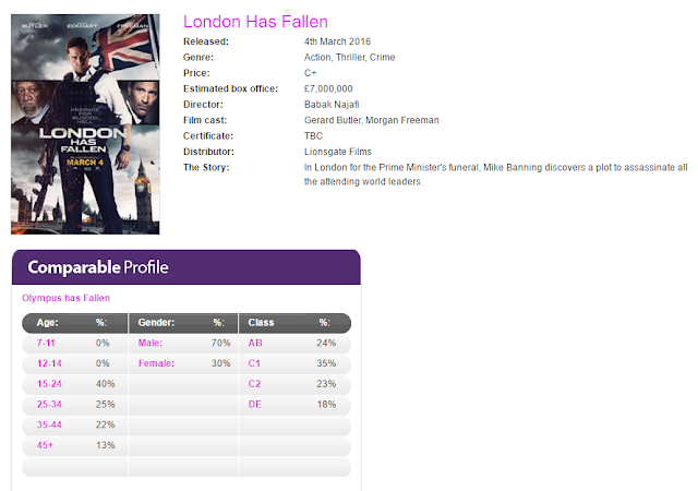
London Has Fallen is an action/crime/thriller that has similar demographics to Imperium in that its gender split is almost exactly the same at 70% male, 30% female. This data may also be slightly more reliable and accurate as this film was released many months ago, while Imperium's may fluctate as the opening weekend, which has not yet completely passed, can influence the data. However, it is still clear that crime films have a very large appeal to males. In terms of age, the film is similar in that the 15-24 bracket dominates at 40%, while the other brackets have a steady decrease as they increase in age, with the lowest being ages 45+. The classes have a fairly equal split of 20%+ each, with C1, the lower middle class, having the highest at 35%. DE has the lowest amount of members as it occupies 18% of the film's viewership, suggesting that people such as students, casual workers, the unemployed, etc, aren't very interested in such a film as this where the plot concerns a man who "discovers a plot to assassinate all attending world leaders" at the Prime Minister's funeral in London. Overall, this film's demographics are useful because they suggest that, through being very similar to Imperium's demographics, crime genre films, irrespective of plot, usually have very similar audiences in terms of age, gender and class and appeal mainly to males rather than females.
How will this research affect my ideas?


London Has Fallen (4th March 2016)

London Has Fallen is an action/crime/thriller that has similar demographics to Imperium in that its gender split is almost exactly the same at 70% male, 30% female. This data may also be slightly more reliable and accurate as this film was released many months ago, while Imperium's may fluctate as the opening weekend, which has not yet completely passed, can influence the data. However, it is still clear that crime films have a very large appeal to males. In terms of age, the film is similar in that the 15-24 bracket dominates at 40%, while the other brackets have a steady decrease as they increase in age, with the lowest being ages 45+. The classes have a fairly equal split of 20%+ each, with C1, the lower middle class, having the highest at 35%. DE has the lowest amount of members as it occupies 18% of the film's viewership, suggesting that people such as students, casual workers, the unemployed, etc, aren't very interested in such a film as this where the plot concerns a man who "discovers a plot to assassinate all attending world leaders" at the Prime Minister's funeral in London. Overall, this film's demographics are useful because they suggest that, through being very similar to Imperium's demographics, crime genre films, irrespective of plot, usually have very similar audiences in terms of age, gender and class and appeal mainly to males rather than females.
How will this research affect my ideas?
This research will affect my ideas through how I appeal to my target audience depending on their age, gender and social status, now that I have inferred through the research of current and past releases that our typical audience member will be a teenager or young adult (in the bracket of 15-24), likely male, and of the C1 class (meaning they are in sub-management roles such as junior managers, supervisors, nurses, etc). In order to appeal to our typical member, I think we should use actors that are of a similar age, although we shouldn't exclude females as actors because this might deter some of our target audience and reduce our potential reach. In terms of the content of our trailer, we should keep the levels of violence, gore, etc to an amount that isn't excessive or too extreme, in order to make it appropriate for an age certificate of 15 to broaden our audience to include teenagers.
Further Audience Profiling Research
Source: YouGov Profiles (https://yougov.co.uk/profileslite#/)
Source: YouGov Profiles (https://yougov.co.uk/profileslite#/)
The Wolf of Wall Street (2013):
From this more extensive data from YouGov Profiles, we can see that the audience for The Wolf of Wall Street, a crime film of 2013 are male, ages 18-24, of social classes A, B and C, and have general interests in film, politics and international news, and have professions in the media, business and civil society and charity. They are also interested in films and TV shows of similar themes such as American Hustle (2013) and Breaking Bad (2008-2013). Their opinions seem to represent the culture of the crime genre: for instance, "I like to go to trendy restaurants and bars" and "When I drink, I drink to get drunk", which to me reflects the tastes of some of the characters in crime films, such as the stereotypical 'gangster boss' or 'drug lord'. Although, this average member describes themselves as analytical, knowledgeable and confident, which I think is useful information because it suggests that my group's target audience may enjoy a trailer more if it gives them an element of mystery and keeps them guessing and doesn't employ a typical narrative.
The Usual Suspects (1995):
The demographics given for people who are fans of the 1995 crime film The Usual Suspects are very different from those given for The Wolf of Wall Street, perhaps most noticeably through age and social status. Although both audiences share some general interests and opinions, the difference in age means that their 'likes' in terms of similar films, TV shows, etc are more dated and the Usual Suspects audience appears to prefer the classics.
To conclude, upon comparison of this audience and the data given for The Usual Suspects, I think that new crime films tend to have demographics that are a lot younger, hence the earlier Pearl & Dean data implying that crime films appeal to the younger generations, while older or classic crime films tend to have an audience composed of the older generations, likely to a difference in interests. For example, while The Usual Suspects is fairly unconventional in that its narrative concerns the criminals rather than the authorities pursuing them, the older generation seems to prefer the classic crime narrative and they have more formal interests (such as believing newspapers should spark debates and challenge perspectives). The interests of the younger audience of The Wolf of Wall Street are a lot more informal in terms of their interests, hobbies and humour. Therefore, as aforementioned, modern crime films seem to focus more on a criminal vs. criminal narrative that will appeal more to younger people, which means that we could potentially fill a gap in the market and aim to appeal to more than just our typical young audience member and try to be more inclusive.
My Target Audience
To present my target audience I decided to take a similar approach to that of YouGov's profiles and created a collage of what I think my audience is interested in based on similarities between these interests and my film.

I created this moodboard/collage based on TV shows and films that have a theme of crime and are likely to be of interest to our target audience. From this collage, you can see that our target audience is interested in films such as Gone Girl, Imperium, The Departed, Pulp Fiction, Ghost in the Shell, Legend, American Psycho, The Usual Suspects, Prisoners, Zodiac and A Clockwork Orange, and are also interested in TV shows such as Breaking Bad, Fargo, Dexter, Sherlock and Hannibal. I am targeting this group because I believe that if they are interested in shows and films such as these that I find enjoyable myself, I can aspire to follow some of the same themes and iconographies that they display, which in turn will aid my group when we are trying to appeal to our audience. For example, in particular I find Breaking Bad and Prisoners' use of cinematography very inspiring (such as the cold blue hue Prisoners seems to use to convey mood) so I believe that if I aim to create my own defined style of cinematography then not only will my trailer appear to be more professional, it may attract a similar audience to the kind of viewership they have. To conclude, I think that observing what makes these shows and films' audiences attracted to them will help me to be more successful in creating my own appealing trailer that is suitable for both its genre and audience.
Wednesday, 21 September 2016
Primary Audience Research: Survey
The purpose of this survey is to gather data concerning the interests of a potential target audience for an upcoming film trailer of the crime genre. The people I give this survey to will likely be older teenagers and adults, so that the data will be in keeping with our intended target audience and we can ensure that the results we take into account when creating our trailer will be relevant and accurate (to make this certain I will discard anomalies when finding the average of any data).
The Survey:
1) What is your age?
_______________
2) What is your gender?
_______________
3) When choosing a film to watch, what genre do you usually prefer?
[ ] Romance
[ ] Comedy
[ ] Horror
[ ] Thriller
[ ] Western
[ ] Fantasy
[ ] Animation
[ ] Action
[ ] Musical
[ ] Crime
[ ] Adventure
[ ] Drama
[ ] Science Fiction
[ ] Hybrid (e.g Rom/Com, Comedy/Horror...)
[ ] Other
4) In trailers, what elements do you take the most notice of?
Pacing (how fast or slow paced the trailer is) [ ]
Cinematography (the way it is shot) [ ]
Sound effects [ ]
Soundtrack / Music [ ]
Actors / Actresses [ ]
Narrative / Plot [ ]
Visual / Special Effects [ ]
Editing [ ]
Dialogue [ ]
5) Do you have a favourite crime film? If so, for what reasons? If not, please state 'N/A' in the space provided.
_________________________
6) In a crime film, what elements do you find the most enjoyable? (e.g action scenes, unusual cinematic style...)
___________________
7) How often is it that after watching a trailer, you pay to see the film in cinema upon its release?
Always [ ]
Most of the time [ ]
Often [ ]
Rarely [ ]
Never [ ]
8) Are there any typical elements that you think make a film trailer of any genre redundant of its intended effect or appeal?
____________________
9) Are there any elements you would like to see in a new crime film trailer?
____________________
I made this survey on the site 'SurveyMonkey' so I wouldn't have to conduct it in-person, as this may have had an influence on some of the answers given. I was also able to design it to give it a more professional look, and having the survey online is also more convenient as it means I could potentially reach more people of the ages in my target audience range through social media.
The Survey:
1) What is your age?
_______________
2) What is your gender?
_______________
3) When choosing a film to watch, what genre do you usually prefer?
[ ] Romance
[ ] Comedy
[ ] Horror
[ ] Thriller
[ ] Western
[ ] Fantasy
[ ] Animation
[ ] Action
[ ] Musical
[ ] Crime
[ ] Adventure
[ ] Drama
[ ] Science Fiction
[ ] Hybrid (e.g Rom/Com, Comedy/Horror...)
[ ] Other
4) In trailers, what elements do you take the most notice of?
Pacing (how fast or slow paced the trailer is) [ ]
Cinematography (the way it is shot) [ ]
Sound effects [ ]
Soundtrack / Music [ ]
Actors / Actresses [ ]
Narrative / Plot [ ]
Visual / Special Effects [ ]
Editing [ ]
Dialogue [ ]
5) Do you have a favourite crime film? If so, for what reasons? If not, please state 'N/A' in the space provided.
_________________________
6) In a crime film, what elements do you find the most enjoyable? (e.g action scenes, unusual cinematic style...)
___________________
7) How often is it that after watching a trailer, you pay to see the film in cinema upon its release?
Always [ ]
Most of the time [ ]
Often [ ]
Rarely [ ]
Never [ ]
8) Are there any typical elements that you think make a film trailer of any genre redundant of its intended effect or appeal?
____________________
9) Are there any elements you would like to see in a new crime film trailer?
____________________
I made this survey on the site 'SurveyMonkey' so I wouldn't have to conduct it in-person, as this may have had an influence on some of the answers given. I was also able to design it to give it a more professional look, and having the survey online is also more convenient as it means I could potentially reach more people of the ages in my target audience range through social media.
Sunday, 18 September 2016
Secondary Audience Research: Reflection
How will the design and ideas for my promotional products be altered to attract the right audience?
Having defined my audience as predominantly males of age 18 and over, I will ensure that my film trailer meets their needs and expectations by endeavoring to have snippets of action and possibly violence (to cater to the expectation of conflict in the crime genre), show iconography such as typical props (guns, weapons, blood) and somewhat conform to conventions our audience would expect and be attracted to. Crime genre film trailers usually aim to spark an 'adrenaline rush' feel, so to achieve this for our audience, I think my group's trailer should dramatically increase in pacing by having the shots, as it progresses and the action comes to a crescendo, shorten in duration and become quicker in succession, possibly synchronized to the soundtrack to make it engaging and exciting.
However, in order to make it unique, we want to create our own cinematic style, such as through making our cinematography more varied by including slow-motion shots, and unusual types of camera shots which will make the trailer more distinctive and memorable; additionally, we plan to use 'glitch-y' and 'pixel-y' footage to be in keeping with the theme of a vengeful hacker character- our intention being to intrigue the audience.
As I previously defined our audience as being interested in TV shows of such as Breaking Bad, which revolves around the theme of drug-use, I believe that the trailer would be more original if we were to make use of unconventional styles of lighting to create symbolism (as this is a technique I have seen frequently in the TV show). For example, one idea is to use contrasting colours in a cross-lighting set-up for a scene such as blue and orange (as opposed to blue and red, which might portray binary opposites, which I want to refrain from doing) to keep it visually interesting and further demonstrate a conflict between characters.
In terms of dialogue, because our audience is composed of mature adults, I think it would be conventional to include words such as swears, where appropriate: this would clearly show that the film is tailored for an older audience. In addition, I don't believe that dialogue should be used to clarify or explain the film's plot, as this might imply that the audience isn't deemed as capable of understanding it for themselves. It might also defeat the purpose of keeping the trailer enigmatic and mysterious, and may patronize the viewer. Another detail I would like to keep in mind is that depending on where the film is set, to maintain accuracy, we should use the appropriate dialect (for example, a particular accent), although, this will likely depend on where we are filming the trailer, too.
The locations we use will need to be appropriate for the situations the characters are in and convey a certain mood; for example, our murderous hacker character's isolation could be conveyed through situating them in a very dark studio with blank walls, (as to not give away any indication of an identity), illuminated only by the screen of the laptop on which they work. The drug user characters should be situated in a run-down shack or abandoned house to give a feel of illegality and a 'hide-out'. The room could be made more atmospheric by using a smoke machine (which implies they're smoking drugs) and natural lighting, perhaps through cracks in windows, to make it seem hazy and surreal. Other locations for this purpose include streets or alleyways; typical places in which drug deals could be made.
The costumes for our characters will be made appropriate according to the character's occupation: with the main characters being a hacker and the drug users, this can be fairly simplistic, for instance, the hacker will likely be dressed in dark or black clothes, along with the 'Anonymous' mask, which we plan to stain with fake blood to make it more menacing and easily convey that this character isn't the stereotypical hacker the audience might first assume. The drug users, as we plan to portray a type that aren't 'drug lords' or dealers themselves, should be dressed in very casual clothing, perhaps baggy hoodies and tracksuits to illustrate that they aren't very materialistic and instead their main priority is to be 'high'.
To conclude, my aim is to include these elements in our trailer in order to attract and engage our target audience, and I think that through the techniques I described, we will be able to achieve our goal of creating a trailer that is both exciting and enigmatic and conveys the plot of our film well.
Having defined my audience as predominantly males of age 18 and over, I will ensure that my film trailer meets their needs and expectations by endeavoring to have snippets of action and possibly violence (to cater to the expectation of conflict in the crime genre), show iconography such as typical props (guns, weapons, blood) and somewhat conform to conventions our audience would expect and be attracted to. Crime genre film trailers usually aim to spark an 'adrenaline rush' feel, so to achieve this for our audience, I think my group's trailer should dramatically increase in pacing by having the shots, as it progresses and the action comes to a crescendo, shorten in duration and become quicker in succession, possibly synchronized to the soundtrack to make it engaging and exciting.
However, in order to make it unique, we want to create our own cinematic style, such as through making our cinematography more varied by including slow-motion shots, and unusual types of camera shots which will make the trailer more distinctive and memorable; additionally, we plan to use 'glitch-y' and 'pixel-y' footage to be in keeping with the theme of a vengeful hacker character- our intention being to intrigue the audience.
As I previously defined our audience as being interested in TV shows of such as Breaking Bad, which revolves around the theme of drug-use, I believe that the trailer would be more original if we were to make use of unconventional styles of lighting to create symbolism (as this is a technique I have seen frequently in the TV show). For example, one idea is to use contrasting colours in a cross-lighting set-up for a scene such as blue and orange (as opposed to blue and red, which might portray binary opposites, which I want to refrain from doing) to keep it visually interesting and further demonstrate a conflict between characters.
In terms of dialogue, because our audience is composed of mature adults, I think it would be conventional to include words such as swears, where appropriate: this would clearly show that the film is tailored for an older audience. In addition, I don't believe that dialogue should be used to clarify or explain the film's plot, as this might imply that the audience isn't deemed as capable of understanding it for themselves. It might also defeat the purpose of keeping the trailer enigmatic and mysterious, and may patronize the viewer. Another detail I would like to keep in mind is that depending on where the film is set, to maintain accuracy, we should use the appropriate dialect (for example, a particular accent), although, this will likely depend on where we are filming the trailer, too.
The locations we use will need to be appropriate for the situations the characters are in and convey a certain mood; for example, our murderous hacker character's isolation could be conveyed through situating them in a very dark studio with blank walls, (as to not give away any indication of an identity), illuminated only by the screen of the laptop on which they work. The drug user characters should be situated in a run-down shack or abandoned house to give a feel of illegality and a 'hide-out'. The room could be made more atmospheric by using a smoke machine (which implies they're smoking drugs) and natural lighting, perhaps through cracks in windows, to make it seem hazy and surreal. Other locations for this purpose include streets or alleyways; typical places in which drug deals could be made.
The costumes for our characters will be made appropriate according to the character's occupation: with the main characters being a hacker and the drug users, this can be fairly simplistic, for instance, the hacker will likely be dressed in dark or black clothes, along with the 'Anonymous' mask, which we plan to stain with fake blood to make it more menacing and easily convey that this character isn't the stereotypical hacker the audience might first assume. The drug users, as we plan to portray a type that aren't 'drug lords' or dealers themselves, should be dressed in very casual clothing, perhaps baggy hoodies and tracksuits to illustrate that they aren't very materialistic and instead their main priority is to be 'high'.
To conclude, my aim is to include these elements in our trailer in order to attract and engage our target audience, and I think that through the techniques I described, we will be able to achieve our goal of creating a trailer that is both exciting and enigmatic and conveys the plot of our film well.
Secondary Audience Research: My Target Audience
My interpretation of the target audience for my group's crime genre trailer is that they are:
18 years and over, due to the violent themes of the film and scenes of drug use, along with the theme of murder
They could be any gender, but predominantly male, because through research it is apparent that the majority of crime films are male-led and cast male actors. Additionally, the violent themes of our film, stereotypically, would appeal to men who are interested in crime and action films.
I think that our target audience's interests may lie with action films, TV shows of a similar theme such as Breaking Bad, and they may dislike trailers that are predictable or too revealing, and perhaps opposite genres such as romance/comedy hybrids. They may also be looking for a crime film that diverges from the conventions of the genre, but isn't a hybrid such as comedy, as these can become uninteresting.
Our target audience may have careers that are involved with crime or law, and want to see a less conventional conflict than the typical 'cop vs. criminal' film.
To help visualize this audience, I drew a general sketch of what the average member may look like:
 This person is male, and of around 20 years of age. As previously described, he is someone who is mainly interested in a film that defies conventions and aims to intrigue its audience through a plot that is less revealing and a trailer that portrays an enigma for him to solve. However, he also likes trailers that are exciting and give an 'adrenaline rush' to keep it engaging and entertaining, and employ unusual cinematographic techniques. This typical audience member likes games, films and TV shows that revolve around a crime theme, whether it is through being the 'detective' solving the mystery (such as in BBC's TV show Sherlock), or being the one who conducted the wrong-doing (such as in American TV show Breaking Bad). Our trailer would appeal to him because it has a very different conflict in that it is criminal vs. criminal, and is unbeknownst to any type of law enforcing body, making it more tense.
However, to get a more insightful and less speculative look at our target audience, I will be creating a survey designed to find out exactly what their interests are and what they may be looking for in a new crime film trailer.
18 years and over, due to the violent themes of the film and scenes of drug use, along with the theme of murder
They could be any gender, but predominantly male, because through research it is apparent that the majority of crime films are male-led and cast male actors. Additionally, the violent themes of our film, stereotypically, would appeal to men who are interested in crime and action films.
I think that our target audience's interests may lie with action films, TV shows of a similar theme such as Breaking Bad, and they may dislike trailers that are predictable or too revealing, and perhaps opposite genres such as romance/comedy hybrids. They may also be looking for a crime film that diverges from the conventions of the genre, but isn't a hybrid such as comedy, as these can become uninteresting.
Our target audience may have careers that are involved with crime or law, and want to see a less conventional conflict than the typical 'cop vs. criminal' film.
To help visualize this audience, I drew a general sketch of what the average member may look like:

However, to get a more insightful and less speculative look at our target audience, I will be creating a survey designed to find out exactly what their interests are and what they may be looking for in a new crime film trailer.
Friday, 16 September 2016
Trailers as Multi-modal Texts
A trailer is a multi-modal text when it displays an array of different modes of communication in order to appeal to their target audience, and uses these modes to create meaning. Features that make a trailer multi-modal are: the use of sound effects, spoken language such as dialogue or a voice-over, moving images, music such as a soundtrack, and written text on-screen. These features, if used effectively, can work together to convey and reiterate meaning; in the table below I will be investigating how the trailer for Doctor Strange (2016) is multi-modal and therefore helps to do so.
TITLE OF FILM: Doctor Strange (2016)
|
||
FEATURES OF MULTIMODAL TEXT
|
DESCRIPTION OF FEATURE IN
TRAILER
|
ANALYSIS OF IMPACT ON
AUDIENCE
|
Written text on screen
|
Throughout the trailer there is on-screen text used to persuade the audience to see the film. Chronologically, these pieces of text are: (Studio Logo): MARVEL "THIS FALL" "OPEN YOUR MIND" CHANGE YOUR REALITY" (Title Card): MARVEL - DOCTOR STRANGE |
In particular, the imperative phrases "Open your mind" and "change your reality" serve to excite the audience as they give clues about the nature and genre of the film. They imply that Mr. Strange, the protagonist, is someone who can manipulate the mind, and possibly, time. Additionally, the use of direct address ("your") makes the trailer more attention-grabbing, because it is inviting the audience to do these exciting things ("open your mind", etc). |
Spoken language
|
The trailer begins with voice-overs from unknown characters who are addressing the protagonist: a man says in almost a whisper, "Steven Strange ... Might I offer you some advice? Forget everything you think you know." A woman then says, "You're a man looking at the world through a key-hole... You've spent your life trying to widen it. Your work saved the life of thousands. What if I told you that reality is one of many?". The woman saying this is revealed at 1:02 in the trailer, and we can see that she is acting as the protagonist's mentor. Besides this, the majority of spoken language in the trailer is dialogue, although at various points it becomes a voice-over when a different clip or shot is being shown, such as when an impressive visual of a room turning and re-constructing itself is shown and the protagonist asks, "Why are you doing this?", to which the woman from earlier replies, "There are other ways to save lives." |
The spoken language in the trailer is mostly for the purpose of giving the shots and scenes being shown context and to ask the questions that the audience may be thinking- for example, when Dr. Strange asks the woman who appears to be training him, "Why are you doing this?". At the very end of the trailer the action seems to stop, and Dr. Strange says to his mentor, "Teach me". This gives the trailer a strong ending that clearly communicates the main plot of the film. Spoken language is also used in to make it more enthralling and intriguing, such as when the mentor says in the first minute of the trailer, "What if I told you that reality is one of many?", a rhetorical question that suggests the film is of the fantasy and science fiction genres. |
Moving images
|
The moving images in the trailer are very cinematic and impressive in how they make use of special effects: visuals are shown of people using their powers to do extraordinary actions, such as in the shot below when a room seems to twist and turn at a man's command:  |
The moving images show the audience not only that it has a large budget and is likely a high-concept film, it has plenty of interesting plot points. Aside from the spoken language and on-screen texts that give context, the moving images keep the film fairly mysterious regarding which direction the film will take, as all we know is that the protagonist's cause is to use his new-found powers to save lives; the trailer doesn't seem to display a disruption to the narrative as yet. The cinematography consists of deep focus style shots and unusual perspectives to keep the trailer visually interesting and impressive. |
Sound effects
|
The trailer is mostly absent of sound effects and instead concentrates on synchronising the soundtrack with clips being shown- for example, when Dr. Strange falls to the ground with a thud, but this sound is actually a sort of bass drop in the soundtrack. However, at 1:42, after the title card is shown and the main action of the trailer is over, the screen fades to black and the diegetic sound of footsteps can be heard. Dr. Strange, in a costume we can assume signifies his transition into a hero, is walking up some steps to a platform. The sound effects we can hear, most likely made by a foley artist, are his echoing footsteps and the rippling of his cape in the breeze. |
After the initial lack of sound effects in the trailer, with the majority of the clips being muted with a soundtrack over the top, this sudden appearance of sound effects at the end of the trailer (the footsteps and the rippling of the protagonist's cape) gives an ominous vibe to the audience and may even have the effect of sending shivers down their spine- it makes the last moments of the trailer exciting, prompting the audience to eagerly anticipate the part of the film where Dr. Strange will make his transition. |
Music
|
The soundtrack of the trailer consists of dramatic thuds, bass boosts and drops, and pulsing, incessant sounds. In particular, it starts with a shot of a mystery character underwater, and the soundtrack consists of a sound that is almost muffled, but gradually increases in volume. |
The fact that the soundtrack first introduced gradually increases in volume could be interpreted as the sound that leads the audience in to the trailer and sets the tone for the rest. It sounds quite surreal and digital, possibly signifying the sci-fi or fantasy themes of the film. |
To conclude, I think that the trailer for Doctor Strange is a good example of the ways in which a text can be multi-modal because it makes use of multiple techniques in order to excite and engage the audience, whether it is through on-screen text shown alongside a series of shots in order to clarify the action and plot, or through the use of a lack of sound effects for the majority of the trailer to make those at the very end more effective and have a larger impact; these multi-modal techniques in the trailer all work together and aim to create and convey meaning.
Subscribe to:
Posts (Atom)